Analysing of the BFI Film Festival programme front cover

First of all, the placement of the title and subheadings are nicely stacked together and the cover's placement of the title in the centre of the page rather than the top which is clearly breaking a typical convention. In addition, the title uses flesh tone colours to contrast and bring the main image behind to life. This is to bring draw attention to the leaflet for its uses of striking and evident colours. There is no sign of a slogan, offers, or heavy use of language allowing the readers to focus on the visionary aspect of the leaflet and gives the leaflet a more sleek format and look.
Brochures and Context pages analysed
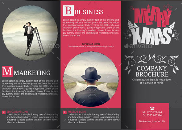
This usage of rounded imaged and dotted line give a sleek and simplic overview. Also the modest colour scheme is also used to allow the reader to focus on all aspects of the brochure such as both text and image.

The title and subheading of this brochure is extremely informative and explanatory of the image presented. The image presented covers largely of brochure and allows the reader to focus on the context of the brochure. The focus is to visually capture the readers.

This brochure uses a colour scheme of black and green to represent and correspond with the context of the brochure which is eco friendly energy.
This brochure is unique as it allows intense use of vibrant and vivid colours to be the focal and enticing part of the brochure.

This brochure is also unique as it the design of intricate and impressive design that differs from most.

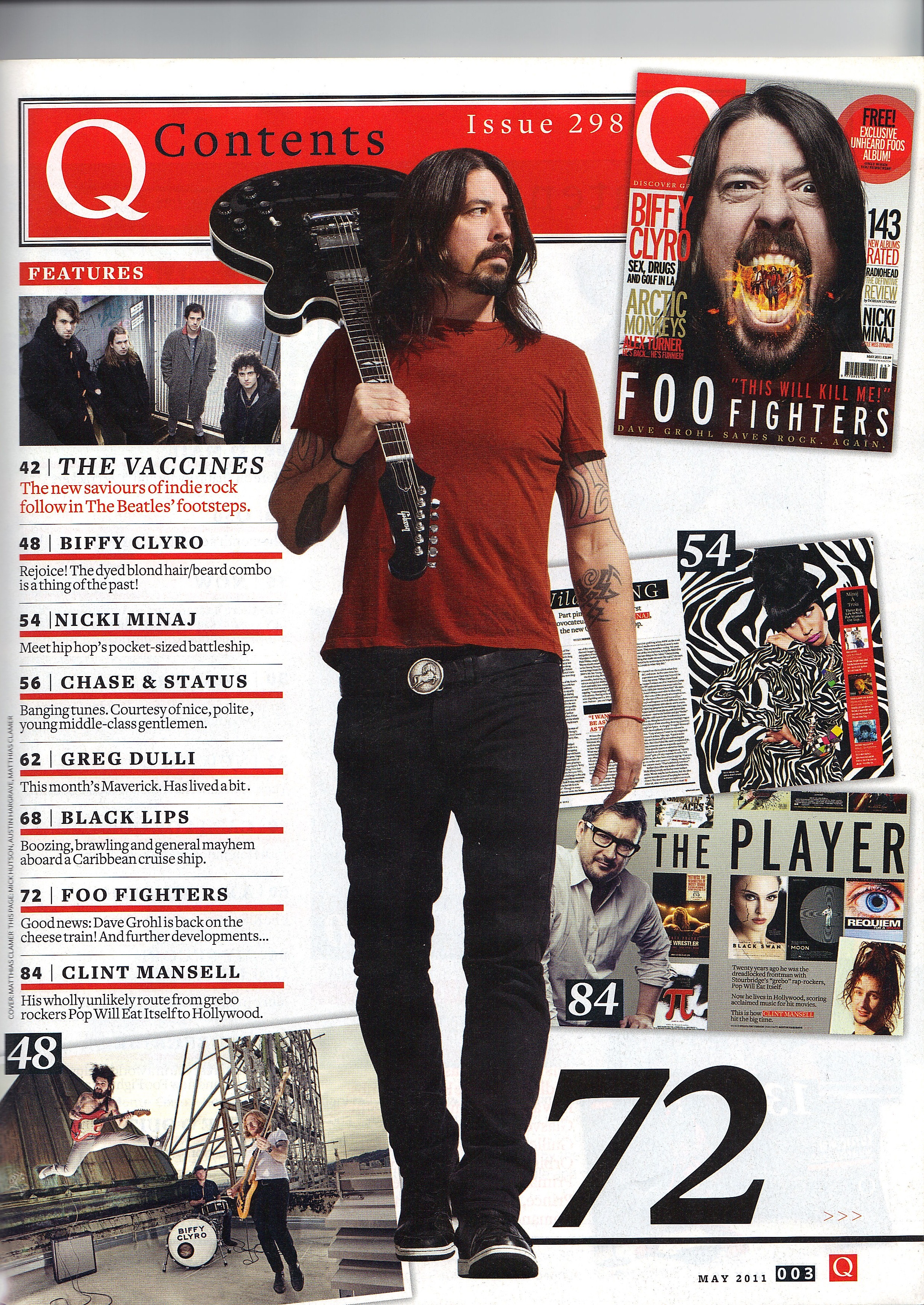
This content page uses duller colours to allow the readers to focus on the images and the design of the page which reflect the theme of cars.

This content page gives more a sleek and simplic overview as it allows the readers to focus on the medium shot of obama.

The contrasting colours between the regular colour scheme used and the red heart is used to present a more striking imagine. Another thing interesting about this brochure is the title which is broken down intro three parts and stacked on top of each other.

This brochure uses a image extracted from a film and placed in front of the title to create a perpetuate a 3D look. The colour scheme is used to create a sleek and impressive look whilst not taking away from the centre image used.
The multiple images used is to present the content and theme of the brochure and the colour scheme is to show the vivid and lambent look.
Planning and sketching
The main target audience would be particularly interested in urban and alternative films such as art house films.
The main target audience will also be in between the ages of 15-25, female and most likely still in education.
The double page spread will consist of the protagonist and antagonist side by side with alluring text relating to story of the short film. This will allow readers to be able to focus on all aspects of the double spread page. The colour scheme will be dull and ominous to allow the readers to focus on the central image.
the text used will be short and simple again to allow the image to be the focal point of the double page spread.
Photoshoot
Aisha and Noora played by Pratish and Nastesha will be on the front cover.
There will be intricately designed format and images to allure and impress the readers visually.
Two protagonist will be side by side to highlight their important and allow them to be the focal point of the magazine cover. This will be a medium shot of the characters.
Contrasting colours and expressions will be used by the two character to clearly distinguish the antagonist and protagonist.
No comments:
Post a Comment